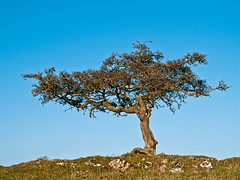
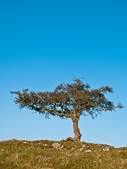
In this particular example – taken in 2007 – there is limited ‘landscape’ available, but even with the low horizon the basic horizontality is clear. This is emphasised by the horizontal structuring of the tree itself which results in the top half of the vertical format being redundant – there is a very clear divide between the upper and lower halves of the image. The landscape format is, to me at least, clearly superior in this instance. The opposite is true however in the next pair, from November last year:
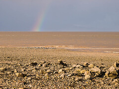
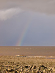
In the horizontal format the rainbow looks to be something of an after thought – if that is possible. It might have been improved with a lower horizon, but then the foreground interest would have been lost, whereas in the vertical format, it is clear that the frame has been more effectively fitted to the subject matter, with a more satisfying shot as the end result.
Finally a pair that seems to work both ways – I’m afraid it’s a sunset (from June ‘11), but I live next to the Solway, which is famed for them so I have more than I care to mention.
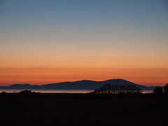
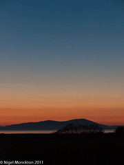
In this case the horizontal layering of colour should probably favour the horizontal format, but the depth of the blue at the top of the portrait format seems to balance the silhouette of the land below to provide, to my eyes, an equally effective composition. And…as I was reading The Poetry of Zen I came across this, which seemed to be made for it, from the Priest Jakuren (1139-1202) translated by Sam Hamill:
Call it loneliness,Conclusion
that deep, beautiful colour
no one can describe:
over these dark mountains,the gathering autumn dusk.
The fact that I have so few pairs of photos of this type in my archive does bear out the idea that the basic horizontality of landscape provides real challenge for vertical formats. Where the subject is clearly vertical and sufficiently prominent – the rainbow for example – it can make a vertical format work, and there are some examples where it really doesn't matter. I suspect that the level of abstraction in the sunset photos helps with that.
I suspect that over the years I have applied these principles without any real thought about what I’m doing, so perhaps another key lesson from this project is to be rather more aware of the potential that a view might have for a non-standard treatment (vertical in this instance).
No comments:
Post a Comment