The first exercise seems to me to be about the basic horizontality of landscape photos, and the consequential importance of the location of the horizon line. It seems to me self-evident that if there is an interesting sky a composition which favours the sky is likely to be more important and if the opposite holds then a composition which favours the land will win out. If they are of equal interest it is clearly an artistic choice about which to emphasise – and perhaps this holds in all cases. I can choose to emphasise a dull sky over an interesting landscape if I wish. Jugnet and Clairet’s Louis Bleriot is a twist on this – they have chosen an extremely low horizon beneath a featureless blue sky – so with almost nothing to work on we are left to reflect on the blue of the sky or wonder about the cityscape below, hinted at by the vestiges of the roofline at the bottom of each photo.
A further couple of slightly subversive thoughts intrude at this point:
- is the placement even vaguely important if the photo itself is as dull as ditch water?
- what if the horizon – defined as the interface between land and sky – is vertical?
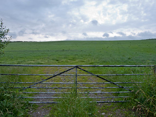
The shots for my first pass at this exercise are taken on a tripod from the grass free area on the left hand side of the gate. From this location and using a standard lens not even the barely visible top of a pylon on the left of the horizon intrudes on the dullness. Sadly I did not have the courage of my convictions – I didn’t go out in the rain and drizzle with a flat grey sky, as a result of which this is more an illustration of the impact of horizon placement when the sky is the main point of interest. I will revisit this exercise once I have some REALLY dull photos for comparison. So here are the shots:

In this shot the sky is clearly the centre of interest. I can’t help the feeling that instead of providing ‘base’ to the image the tiny strip of land at the bottom actually distracts, and reduces the impact of the photo because it looks like an error.
 That concern is much diminished in this shot because the strip of land is clearly deliberate. The fact that it is not really interesting is irrelevant as the focus of interest is the rather dramatic sky.
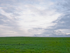 While it is difficult to be certain because of a difference in sky exposure in this shot, I feel it is slightly less effective than the previous version because the land is beginning to be too dominant, without adding anything of interest to the shot. It leaves a ‘nice sky, pity I can’t see more of it’ impression. Were there something in the foreground, I suspect this would actually be the most successful shot because the visual balance would be more aceptable – which is probably aided by the fact that it roughly coincides with a ‘rule of thirds’ type composition.
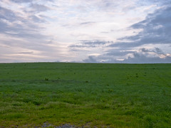 This is as near to central as I could get the horizon, and yet, because of the difference of interest between the sky and the land it appears somewhat unbalanced, which is an unexpected visual effect.
 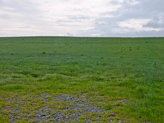 This – to me anyway – is the least satisfying shot. The foreground has no real redeeming features and the sky is too small to be of interest, but too prominent to be overlooked.
 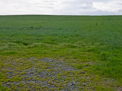 Even here the brightness of the sky means it is quite dominant, especially since there is little of interest in the foreground – it just looks like an oddly composed photo of a field.
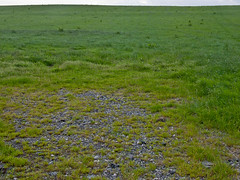 This is an improvement over the previous two shots. While there is nothing of great interest to look at, it is at least clear that it is intended to be a picture of the field itself. The pale band of sky seems less distracting in this context than the thin band of field in the first photo.
 So where does this leave me? There is little doubt in my mind that the second shot is the most satisfying. I will be interested to see how a less interesting sky affects the overall impression and balance, and I may try to find a similar scene with something of interest in the foreground – I might even set up a deckchair or similar
Conclusion
Even on the basis of these initial shots it is clear that the horizontal division provided by the horizon line plays a key role in the overall impact of a shot. It needs to be placed to balance the background and foreground to support the intent of the photo.
No comments:
Post a Comment