Not sure what to make of this “project” as it does not involve a task. It clearly builds on some of the work in Digital Photographic Practise and I have no beef with the content – it’s all reasonably familiar to me – but very film related. In the context of Landscape photography I guess this is still relevant given that anyone using a large format camera – still the weapon of choice for keen landscapers – will be restricted to film. However as the text notes for digital cameras variations in colour temperature can generally be dealt with either in post processing or by selection of a custom white balance on the camera.
What I find more difficult to fathom is that the text makes little mention of the creative choices that come into play when trying to balance colour. In sunlight there is undoubtedly a preferred ‘right’ colour that most people would find most acceptable, but as the text notes, this naturalness can be disrupted by a range of factors, including weather, surroundings and time. Even in these cases there are examples where non-neutral lighting looks natural – the red of sunsets being a case in point. But what about mixed lighting? Or landscapes by artificial light?
For example, which of these is correct – if the term has a meaning in this context? They are a lit by a mix of mercury vapour and fluorescent lights, while the sky is a reflection of the mixed lighting of the city beyond.
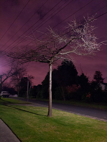
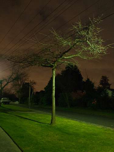
The one on the left is balanced using the grey of the path in the bottom left corner and provides a more accurate rendering of the grass, the second is out of the camera and gives a more accurate rendering of the sky. I actually like both – so the one I choose to display must surely be an artistic decision depending on for example whether I am trying to convey the oddness of suburbs at night – in which case the out of camera version would be my choice, or to emphasise the graphic quality of trees in winter – in which case I think the purple sky version is more effective. I could, of course, have set a white balance using a white target close to the tree – and I rather wish I had now because now I’ll never know what a neutral rendition looks like. So there’s Lesson 1. A similar set of arguments applies to this pair:
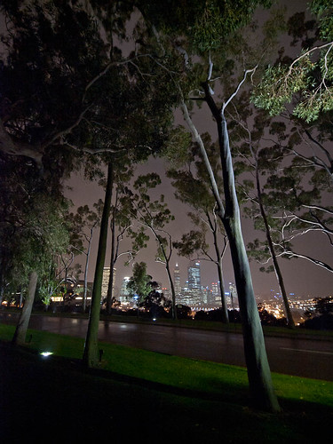
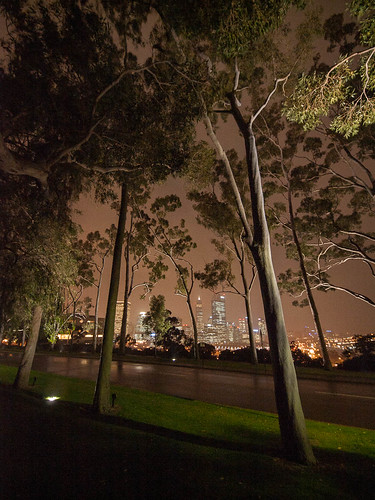
The left hand shot uses Lightroom’s Auto white balance, the right hand is using the camera’s idea of Auto white balance – which is interesting in itself as they are clearly calibrated differently. In this case I find it hard to choose a preferred treatment. The left hand shot is cooler and has, perhaps, a slightly more dramatic feel while being truer to the general grey nature of Australian foliage. On the other hand the right hand shot is warmer and perhaps murkier – which is truer to the conditions of the time as it was raining lightly. In isolation I feel either works, but there is a very clear choice to be made if the idea was to use this as part of a portfolio.
At the risk of protesting too much – it seems obvious to me that this shot would be pointless if the colour was neutral and properly balanced to make the tarmac grey/black – something I have not, in any case, been able to achieve in post-processing. Not that I would want it neutral – this was how I planned it – emphasising the texture and colour.
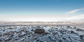
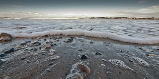
For a final example in this post I’ve reworked a couple of the wave shots from this previous post to give a different colour rendering. As I noted in that post I felt that the more neutral /less saturated colour simply made the shots feel muddy but a fellow student suggested that they seemed a bit oversaturated so I felt it was worth going back for another look.
Both of these are balanced using the ‘Shade’ setting in Lightroom – acknowledging the fact that in both the foreground is in shadow – lit only by the light from the sky. In the first case this is close to the Auto setting from LR, and in the second it is close to a manual white balance using the row of foam as a white. They are clearly more natural (except for the odd sky in the second) but I feel they lose impact and no longer hang together so well as a set. The sea was blue, the sky was blue, it was quite a cool day – everything screamed blue – so on balance I’m going to stick with my original rendering – but it does emphasise that personal preference has a major role to play.
Lessons
- If the opportunity arises at least make a shot with a custom white balance – it may not give the answer you want, but it will provide some kind of ‘natural’ reference.
- When using non-natural lighting there is often more than one right answer – the right right answer will depend on end use and personal taste.
- There will be plenty of situations in simple lighting where there is a generally preferred correct rendition, but even something as simple as the presence of large areas of shades forces you into the area of ‘artistic’ decisions.
No comments:
Post a Comment