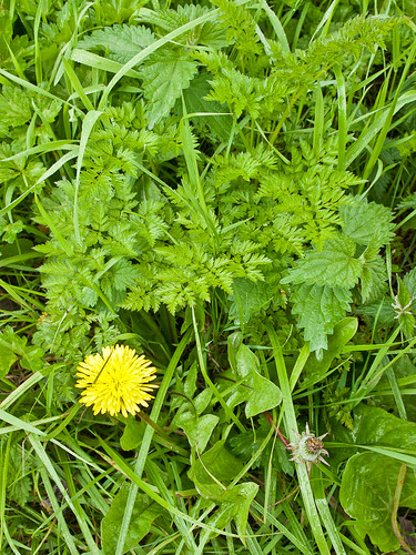
A number of the later projects leading up to Assignment 1 are about colours – strong colours, soft colours, colour themes, colour contrasts. One thing is immediately apparent on a trip out with a camera to deal with these – the text isn’t joking when it says strong colours are hard to find in the traditional British landscape. Particularly at this time of the year, green is the predominant colour, whether in full luxurious Technicolor, or rather more muted:
A quick look at a colour wheel will show that the contrasting colour for green is red, and it’s at this point that the seasons begin to intrude. Ask anyone to name a red flower and the answer ‘Poppy’ will surely be high on the list, as will ‘Rose’. And there’s the rub – red roses and poppies are not find in the wild, in my neck of the woods, at this time of year. The next best bet is red-violet or red-orange – at which point Campion comes into its own:
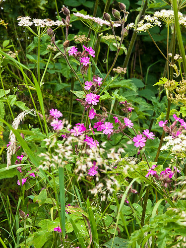
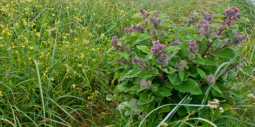
In relatively soft light, so that the colours don’t burn out this combination can fizz – yet at the same time, in the flesh they look rather muted and delicate. A rather softer contrast, with a bit of acid yellow thrown in for seasoning can be found down on the dunes where the gentle lilac of the Burdock forms an almost harmonious mix with the green and yellows – in spite of the relative positions on the colour wheel – again this is helped by the relatively soft lighting.
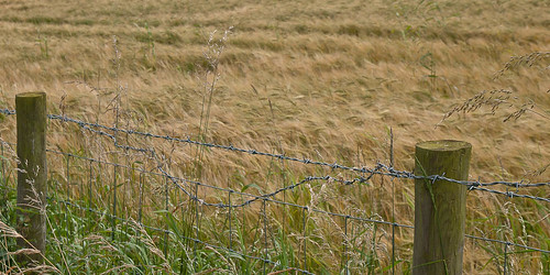
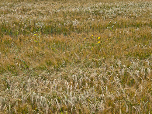
By way of a contrast the bright yellow of these cereal field weeds lifts them from the relatively muted background of the ripening crop in spite of the relative closeness on the colour wheel.
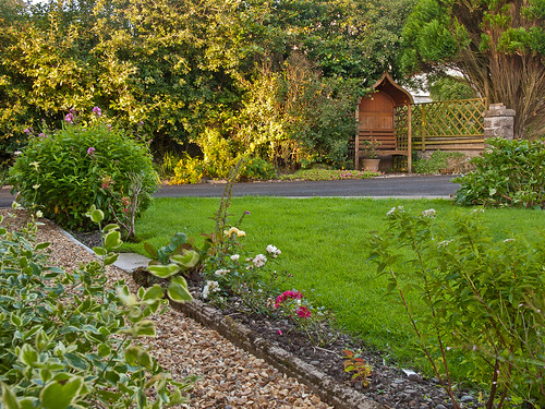
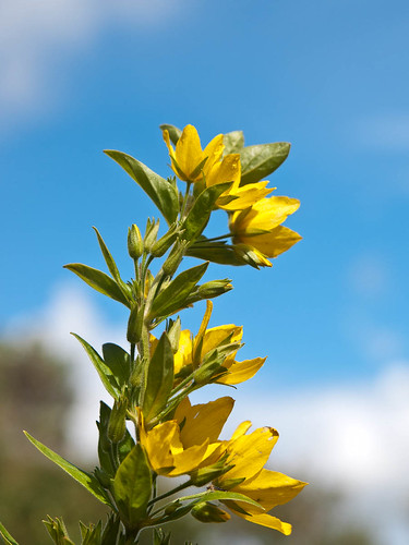
Returning to a more manicured landscape makes the job a little easier – domesticated flowers are usually brighter – and variegated shrubs increase the range of greens quite dramatically. In the first of these the range of greens is extended by the mix of shade and evening sunlight. In the second, a dramatic colour contrast has been achieved by the simple expedient of shooting against the sky:
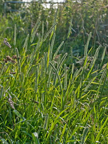
A similar effect can be obtained – without the colour contrast - by shooting with the light behind the plants. the transmitted light lifting the colours dramatically. One of these in the wild the other in the garden:
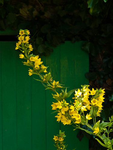
Both of these last two also make use of sharpness and colour to add depth to shots in which there is actually very little physical distance between the subject and the background.
What would I have found at a different time of the year?
A good question. At least in my part of rural Cumbria, spring would be typified by an even greater range of greens as the various hedges and hedgerow plants started to produced new leaves – yellow still predominates as a flower colour – Wordsworth wrote about daffodils for a reason, but in the areas that used to be woodland (or in woodland itself) the blue of bluebells would be a key them. In the open fields the contrast between oil-seed rape and the sky would also offer some dramatic, if well used , opportunities for colour contrast.
Predictably, in the autumn browns, reds and oranges will predominate – but the blue of sloes, and the blacks and reds of blackberries and haws offer some relief. Yellow would be found on birch leaves and similar and close inspection might even find a red toadstool for variety. Sadly, for the most part, winter is like a colourless version of autumn, although in frosty conditions we could rely on robins and yellowhammers to brighten the garden alongside a few exotic imports – if nothing else.
Cliché or symbolism?
All this raises an interesting question in my mind – are bluebells, hedgerow flowers, autumn leaves and robins clichés? Or are they easily read symbols that give us clues to the timing of the photos and pictures that feature them? If the timing of the shot is important for the message does the inclusion of one of these reduce the shot to cliché and render it worthless, or is their inclusion a legitimate tool for telling stories? At the risk of giving away my interest in all things Japanese, haiku make use of such symbols all the time, as does much traditional Chinese/Japanese painting – is their worth reduced as a result? Have we come to deride these things as cheap and obvious because we have lost some of the link with the world around us - as a self-defence mechanism because to many of us they are – with a few limited exceptions such as robins - no longer obvious?
No comments:
Post a Comment